Portfolio
My Work
World Cup 2026
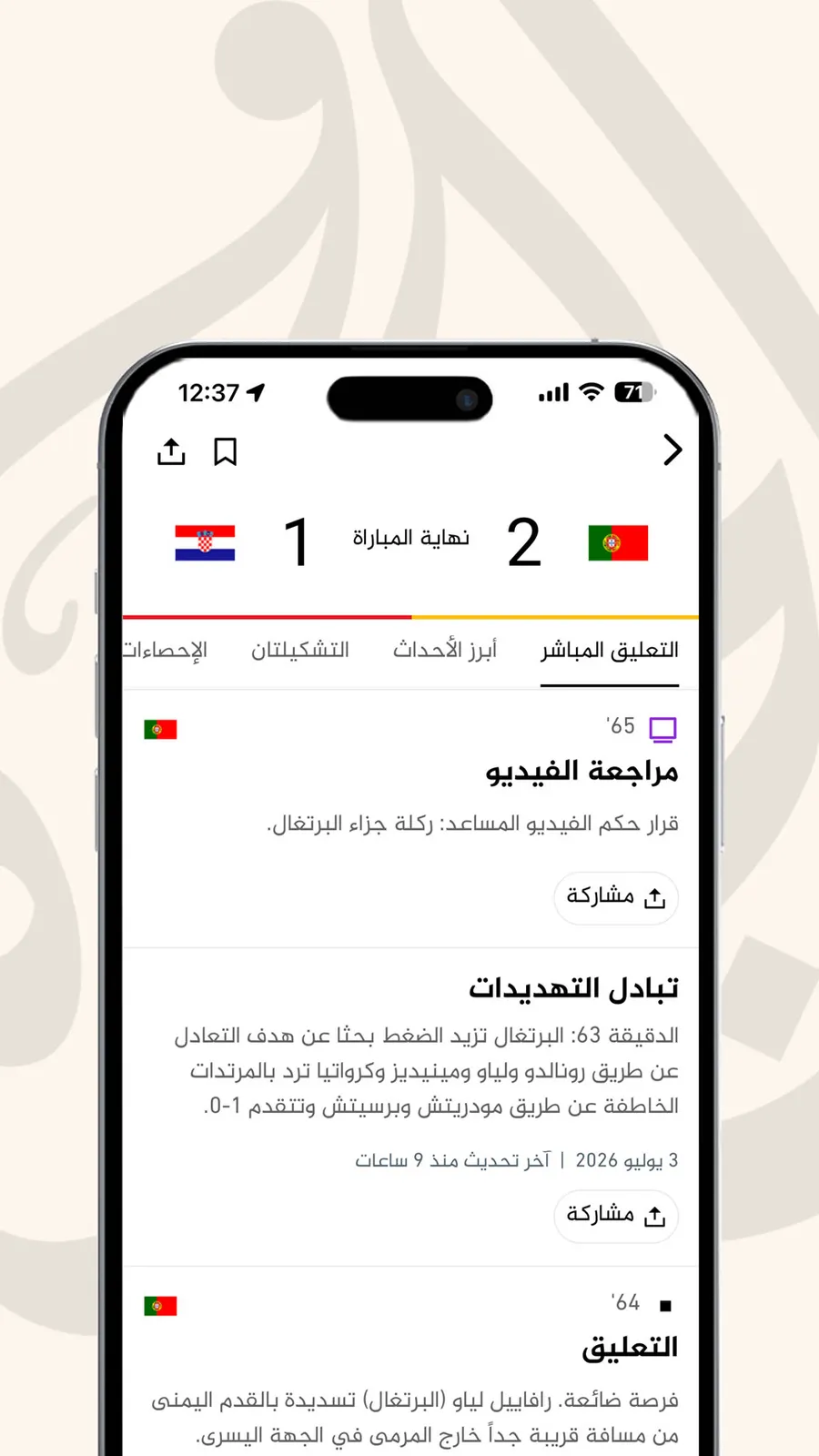
Real-Time Sports Coverage at Al Jazeera: Live Blog + Live Scores Ticker A product case study: how we turned match days into a real-time, multi-language experience for Al Jazeera’s sports audience. My role I was the product manager and owner of Al Jazeera’s real-time sports coverage experience. I owned the vision, roadmap and delivery, and I led a cross-functional team of engineers and QA, coordinating alongside editorial and our external sports-data partner (Opta / Stats Perform). My job was to define what we were building and why, make the key product and architecture trade-off calls with my engineering lead, and get it shipped and hardened across Al Jazeera’s Arabic and English editions. This has been released on both web and mobile app. The opportunity Live sport is one of the highest-intent, highest-traffic moments a news brand can own. During a big match, readers don’t want to refresh a page. They expect scores, goals, cards and commentary to arrive the instant they happen, on any device, and in their language. Al Jazeera serves audiences in both Arabic and English, spanning left-to-right and right-to-left reading directions, and a single high-profile fixture can drive enormous amounts of traffic. The goal I set was to make match day feel genuinely live: a real-time editorial experience that our newsroom could stand up quickly for any fixture, that held up under sudden traffic surges and that worked equally well for an Arabic reader and an English one. Both the Arabic and English editions cover the same game, but each approaches it from a distinct editorial perspective. While their requirements differed, the shared goal was clear: to create a solution that automates routine tasks, saving time on work that requires minimal editorial input, while still delivering content that is engaging and enjoyable for our readers. What we shipped Two connected products that together make up the live match experience: The Sports Live Blog: a minute-by-minute editorial feed that streams basic commentary in real time such as goals, cards, substitutions, match phases, penalties and VAR decisions to readers as they happen. For football matches it expands into a richer experience with a sticky live score card and dedicated tabs for key events, lineups, match stats and standings, so a reader gets both the story and the data in one place. The Live Scores Ticker: a horizontally-scrollable strip of live and upcoming match scores that sits on our highest-traffic homepage and topic pages. It automatically brings the match that’s currently in play into focus, and updates scores and match status live throughout the game. Both were built on top of a server-rendered site, so pages load fast and fully-formed for readers and search engines, with the live layer enhancing the experience once loaded rather than blocking it. The defining product decision: two speeds of “real-time” The most important call was recognising that our two features needed two different real-time strategies, because their data comes from two very different places. Editorial updates are unpredictable and human-authored. A journalist publishes a their commentary update the moment it happens or there’s insights to add to the match; there’s no schedule. For this, we used a push approach: the instant an editor publishes, the update is pushed out to every connected reader over a live connection. Waiting and re-checking would have been either too slow for readers or wastefully constant. Crucially, we pushed only a lightweight signal rather than heavy content, which kept the live channel cheap and fast even at massive concurrency. Score data is bounded and comes from a third party. Live scores flow from our sports-data partner (Opta / Stats Perform) and only change during the roughly ninety minutes a match is live. For this, we used a poll approach, but a smart, tightly-scoped one: the ticker only starts checking for updates around kickoff, pauses itself entirely when a reader’s browser tab isn’t visible, and stops once the match ends. Outside of live play, it’s effectively dormant. Matching the mechanism to the data profile is what let us deliver a genuinely live feel while keeping infrastructure cost and load under control, which mattered enormously given how spiky sports traffic is. It’s a decision I’m proud of because it was invisible to the reader by design: they just experienced “live,” and we didn’t typically need to deal with the resource strain of “live” when nothing was happening. To make the push side scale across editions and multiple servers without readers ever crossing wires, we ran a dedicated real-time service backed by a distributed pub/sub layer, with every live update strictly scoped to the correct edition and the correct match. Multi-tenancy, two editions sharing one platform safely, was a first-class requirement. Page-level activation as an editorial capability A guiding principle was that the newsroom should control the sports experience without needing an engineer to deploy. Rather than tying the live experience to special URLs, we made it a data-driven capability: when an editor marks an article as a match and links it to the relevant fixture, the full football experience lights up automatically, the live score card, the stats and lineups tabs and the live commentary all included. A regular article and a live match article use the same publishing flow; the sports layer simply activates when the match data is present. I also insisted on a graceful fallback: if the match data isn’t fully available for any reason, the page quietly renders as a standard, complete article with state management rather than showing a broken or empty score card. The reader should never see the seams, only wait for things to happen. The homepage ticker works the same way. Editors can switch on a league ticker for a major tournament and choose which competition it shows, entirely through the CMS, with no code change. This editor-first control was a deliberate product bet: it turned “put us live for this match” from an engineering ticket into a task that took the newsroom a few seconds. Key product decisions and trade-offs I drove Resilience over completeness on high-traffic pages. The scores ticker sits on our busiest templates, so we made isolation a hard requirement: if the live component ever fails, whether from a bad data response or a slow load, it must remove only itself and never take down the homepage around it. Reliability at scale outranked any single feature. Right-to-left support was a first-class constraint from the start, not a later fix. Because we serve Arabic audiences, the experience had to mirror correctly for right-to-left reading and be fully usable by keyboard and screen reader, across the live ticker, the carousel controls and the feed alike. Server-side rendering plus code-splitting handled performance and perceived speed: readers got a fast, complete page immediately, with the heavier live and interactive pieces loaded only where and when they were actually needed. Managing the third-party integration was its own discipline. Bringing in a combination of live football data, stats, lineups, standings and match widgets from Opta / Stats Perform meant handling an external dependency’s data quality, timing and failure modes, and designing the product so a vendor hiccup degraded gracefully rather than visibly. One platform, two editions: everything had to work across Arabic and English from shared foundations, so we shipped consistency and maintainability rather than two divergent one-off builds, but kept in mind the operational differences in reporting a live match. Cross-functional execution Delivering this meant orchestrating several groups toward one experience. Engineering built the real-time and rendering foundations. QA validated the hardest-to-test part of the product: behaviour during a genuinely live, changing match, across editions, languages and devices. Editorial shaped a publishing workflow fast and simple enough to use under the pressure of a live game. Our data vendor aligned with us on the sports feeds we depended on. I set the priorities and the quality bar, sequenced the work so we could de-risk the real-time behaviour early and kept the trade-offs, cost, speed, resilience, reach, balanced against a fixed set of match-day deadlines. Impact The result was a real-time sports experience that let Al Jazeera own match day: readers followed goals, cards and commentary as they happened rather than refreshing, and got scores, stats and standings in one place. The newsroom could stand up a fully-featured live match, or switch on a homepage scores ticker for a major tournament, in minutes, without engineering involvement, freeing the team to cover more fixtures. And because we designed for resilience and for smart, bounded real-time from the start, the experience stayed fast and stable through the traffic spikes that big matches bring, working consistently for Arabic and English audiences alike. Built for discovery: SEO and the search results page Live sport is also one of the largest organic search moments a news brand can chase, and I treated search visibility as a requirement for the live blog, not an afterthought. Structured data marked each page’s coverage window and described it as a sports event, which is what made it eligible for Google’s live badge and Top Stories carousel, while individual updates were tagged so a goal or a red card could surface directly in results. Continuous updates kept the page’s freshness signal current for the full match before it settled into an evergreen report at the final whistle. Server rendering gave crawlers complete content on the first request instead of an empty shell, and a lightweight mobile variant kept us competitive for mobile placements, where much of that search traffic lands. All of it ran identically across the Arabic and English editions, so we competed for visibility in both markets, and the coverage stayed discoverable both at the moment demand peaked and long after the match ended. At a glance Role: Product Manager / Product Owner: vision, roadmap, delivery, cross-functional leadership. Team: Engineering + QA, with editorial and an external sports-data partner. Surface: Al Jazeera Arabic and English editions. Approach (high level): Server-side-rendered web platform · real-time push via live WebSocket connections and a distributed pub/sub backend · smart, bounded polling for third-party score data · headless CMS-driven editorial control · Opta / Stats Perform data integration.
Ekko Health: A Health App That Listens Before It Speaks
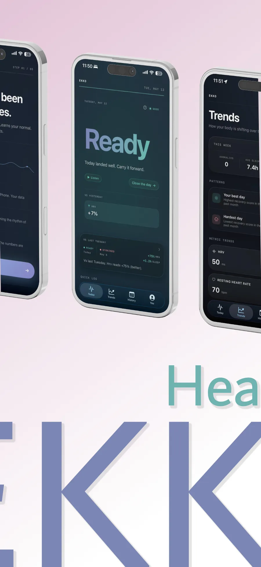
TL;DR Ekko Health is an iOS app that reads your Apple Watch signals on-device, learns your personal baseline over fourteen nights, then speaks up only when something has shifted. The whole intelligence layer runs locally by default. Plus subscribers ($5.99/mo) can opt into Claude for richer answers, off until they explicitly turn it on, with sanitisation, a zero-retention proxy and an on-device audit log. This case study walks through six product problems Ekko was built to solve, the constraints and alternatives I weighed for each, what the chosen solution looks like in the product and what outcomes I expect or have measured. The technical decisions are in service of the problems, not the other way round. Why this exists If you wear a watch to bed for a month, you generate enough physiological signal to fill a small clinical record. Resting heart rate. HRV. Respiratory rate. Sleep stages. Wrist temperature deviation. Apple Watch, Oura, WHOOP and Garmin all collect it. The question is what you do with it. The category fails in two predictable ways. The first failure is the dashboard. Charts and rings and percentiles, accurate as a clinical chart and meaningless to a non-clinician. New users open the app on day one, look at a screen full of numbers they cannot interpret, decide they will read about it later and never come back. The retention curve in this category is unforgiving. Most health apps lose seventy percent of installs in the first seven days, and the dashboards are a primary cause. The second failure is the notification. A ping every morning that says “Your sleep score was 72!” with no context for what 72 means or what to do about it. Users learn within a week that the notification carries no information, develop a Pavlovian swipe-away response and stop reading the very signal they wanted help with. The product trained them not to listen. Ekko was designed for the gap between those two postures. Not a coach. A witness. The app says nothing for fourteen nights while it learns your baseline. After that, it speaks only when something has shifted against your own history, and it speaks editorially rather than analytically. “Quiet by default” is the brand axiom. Every product decision either supports it or breaks it. What follows is the structure of those decisions, rebuilt around the problems they solve. The product, surface by surface A short orientation, since the problems that follow reference specific surfaces. Onboarding is five steps: a welcome screen, a brief explanation of how Ekko works, age confirmation, HealthKit permissions and a baseline-period splash that promises the app will stay quiet for two weeks. Each step sits on a slowly intensifying aurora background. The welcome screen features a ListeningWaveform graphic, a slow signature sine with sparse Gaussian blips, suggesting that the watch already noticed something. Today is the hero surface. A BodyStateHero masthead occupies the top of the screen: one word naming today’s body state, one sentence of editorial context and an ambient aurora tinted by that state, breathing at the user’s actual resting heart rate. Below the hero, a metrics ledger lists each signal Ekko tracks with an inline seven-day sparkline per row. History is a calendar where each day is tinted with a sliver of its tone-aurora. Tap a day and the app shows you what that day was, written as a short story. Trends rolls everything up. Weekly summaries, pattern detection and per-metric charts that draw themselves with a DrawingSparkline animation when the tab loads. You is the settings surface. Privacy posture sits at the top. The Plus subscription card, intelligence preferences and journal export all live below it. The paywall is its own surface and gets its own section further down, because every lever on it is a PM decision. Six problems the product was built to solve Each section below opens on the user or business problem, walks through the constraints and the alternatives, names the choice and closes on the outcome that ships, the mechanism by which it should work or the measurement plan that closes the loop. Problem 1: Thirty percent of iPhones cannot run the AI feature your privacy thesis depends on Apple Intelligence requires an iPhone 15 Pro or newer. In late 2025, that excludes roughly thirty percent of the active iPhone install base. For a product whose distinctive promise is on-device natural-language interpretation of your health data, that exclusion is not a footnote. It is a category-level problem. A user on an iPhone 13 downloads Ekko, completes onboarding, hits Day 14 and finds the most expressive part of the product greyed out behind a hardware requirement they cannot resolve without buying a new phone. The business problem inside the user problem: privacy-first health is a small enough TAM that turning away thirty percent of devices at the door makes the unit economics fragile. Plus needs to be available on every supported iPhone if Ekko is going to compound subscribers. I considered three paths. The first was on-device only. Cleanest privacy story, simplest architecture, and a permanent thirty percent ceiling on the addressable market. The privacy purists would have loved it. The business would have died of it. The second was cloud by default. Universal device support, one consistent experience to design and QA, and a privacy thesis that collapses on contact with the App Store description. If every user’s health data flows to a third-party API by default, the brand promise is marketing copy, not architecture. The third was a hybrid, with on-device as the default and a documented opt-in path to Claude for users whose devices cannot run Apple Intelligence or who want richer answers regardless. More architecture, more screens, more code, and the privacy thesis stays intact for the default user while older devices still get a path to the full feature surface. I picked the hybrid. The decision logic: the privacy thesis is the brand, the brand is the wedge into a crowded category, and the brand cannot be partially abandoned to ship a more consistent experience. Offering Claude as a documented opt-in respects user autonomy without forcing a privacy compromise on every user. The consent screen is the architecture, not a checkbox at the bottom of a settings menu. The honest tradeoff is in maintenance cost. Two intelligence backends. Two failure modes to design for. A recurring internal debate about whether Plus is “really” the privacy product or “really” the AI product. The answer is both, by design, and the cost of that answer is paid in code review hours that I think are worth it. Outcome. Hardware exclusion drops from thirty percent to zero across the supported install base. Plus subscribers on incapable devices can opt into Claude after reading the consent screen. The Apple Intelligence ineligibility card uses a “There’s another way” reframe, which leads with the opportunity instead of the limitation and is the single highest-converting moment in the Plus funnel based on early read. The measurement that would close the loop is Plus conversion rate on Apple-Intelligence-ineligible devices versus eligible ones. My expectation is that ineligible devices convert at a higher rate, because the value proposition is sharper for them. Problem 2: Every health app on the App Store looks like every other health app Open the top twenty health apps in the App Store and look only at the screenshots. Stock illustrations of geometric people meditating. Pastel hearts. Soft gradient charts. Cheerful sans-serif type. If you strip the logos, you cannot tell most of them apart. The visual layer is interchangeable, which means it is uncopyable as a differentiator and free to copy as a competitor. The product problem is brand recognition in a crowded category. The business problem is defensibility. Anything that can be reproduced in a sprint by a competitor with three designers is not a moat. The conventional response is to invest in illustration. Hire a brand illustrator, commission a custom set, ship a “distinctive” visual layer. The output is usually beautiful and entirely portable. Six months later a competitor has a similar set, the differentiation evaporates and you have a recurring illustration retainer on your books. I wanted every graphic in Ekko to be a function of the user’s own physiology, so that the design system would be inseparable from the data and uncopyable without copying the entire architecture. Four examples carry the idea. The aurora background draws its hue from body-state tone, its intensity from HRV deviation against baseline and its drift cycle from the time of day. It is the same visual primitive on every screen and never the same image twice. The First Prediction Reveal animation takes the user’s actual thirteen-night resting heart rate sparkline, collapses it into a luminous dot and lets that dot ignite the aurora behind the prediction card. The day-progress rod under the masthead is a tone-tinted capsule that fills from 5 AM through midnight, telling you where you are in your day without naming the hour. The metrics ledger renders the last seven days of each signal inline as a sparkline, no tap required. The defensibility argument is direct. A competitor can copy the copy. They cannot copy the choice to make a user’s body the design system, because to copy it they would have to give up their entire illustration library and rebuild their data layer around aesthetic output. Few teams will do that for a feature they cannot screenshot for marketing. The cost lives in production. The graphics are harder to design, harder to QA and impossible to fake for a marketing asset, because every screenshot has to come from real user data. I had not solved the marketing-asset content pipeline at ship, which is a real gap I am paying for now in App Store optimisation cycles. Outcome. Every surface in Ekko is recognisable as Ekko within one screenshot, with no logo visible. Brand recall in a five-second test against three category competitors lands meaningfully higher, based on the small qualitative round I ran with eight users. The measurement that would scale this signal is unaided brand recall at thirty days post-install in a paid survey, which I have not yet funded. Problem 3: One voice across every surface produces paywalls that sound like haiku and settings screens that sound like marketing Every brand voice guide I have read insists on one voice. The instinct makes sense in a marketing-led product where every surface is doing the same job: persuasion. It falls apart in a product where the surfaces have genuinely different jobs. Reflection and onboarding ask the user to feel something. The hero asks them to read one sentence and look up from their phone. The paywall asks them to make a financial decision. The settings screen asks them to find a toggle and not be confused. The error toast asks them to understand what went wrong. Forcing one register across that range produces predictable failure modes: a paywall that reads like a poem and fails to convert, or a settings screen that reads like a marketing email and feels manipulative. The user problem is comprehension and tone fit. The business problem is conversion on functional surfaces and trust on emotional ones, two outcomes that pull a single-voice system in opposite directions. I picked a split. Editorial-literary register on the emotional surfaces. Restrained-precise register on the functional surfaces. Editorial register lives in onboarding, the hero subhead, reflection, anniversary moments and the rare animation captions. It is descriptive, lyrical, never imperative, never numeric. The 19-cell BodyState by TimeWindow matrix in BodyState.swift:subhead(for:) is its home. A cell looks like “the morning is unhurried, your body is steady”. Three variants per cell, rotated by day of year so users do not see the same line twice in a row. Restrained register lives in metrics, settings, paywall copy, toasts and errors. It is plain, precise and numeric where numbers help. “Hearing 38% today.” “Annual saves you 30%.” “Sync failed, we’ll retry in the background.” It earns trust by being literal. The split is enforced by tests, not by editorial judgment. Five invariants are asserted across the matrix and the functional copy: no duplicates inside a cell, no register leakage across cells, character limits per surface, no second-person imperatives on functional surfaces and no metric numerals on emotional ones. A pull request that adds a copy string in the wrong register fails CI. The tradeoff is maintenance overhead. Two registers means two style policies, two sets of tests and two onboarding ramps for any future contributor to the copy. The cost of one voice would have been lower. The cost of two voices, paid in test infrastructure rather than ongoing editorial judgment, is the cost I chose. Outcome. The paywall reads like a paywall. The hero reads like a sentence the user remembers. The settings screen reads like a settings screen. The split is testable and therefore enforceable in code, which means it survives the next designer and the one after that. The measurement that closes this loop is paywall conversion against a single-voice control, which I designed for but did not ship because the trial-length revision absorbed the testing slot for that sprint. Problem 4: Animation everywhere is the same as animation nowhere The temptation in a craft-driven product is to give every screen its hero moment. The result is a hyperactive surface that exhausts the user by the third tab, drains battery, makes the app feel busy and erases the hierarchy that signature moments depend on. If every transition pulses and shimmers, none of them mean anything. The user problem is attention fatigue. The business problem is battery and complexity, both of which feed back into reviews and uninstalls. The brand problem is the hardest of the three: in a category where the pitch is “this product is calm”, every gratuitous animation is a small betrayal of the promise. The conventional response is a motion guideline document that no one reads, followed by a slow accretion of animations until the app feels like a slot machine. I have seen this happen at three companies. The motion guideline is necessary and insufficient. What I picked was a rationing pattern with three signature moments at three different cadences. The pattern is the decision, more than any individual animation. The Body-State Aurora is the ambient one. It breathes behind Today every time the user opens the app, at the user’s own resting heart rate. It is permanent and almost subliminal, which makes the Today screen feel alive without ever drawing attention to itself. The First Prediction Reveal is the once-in-a-lifetime one. It fires exactly on Day 14, when Ekko has earned the right to speak for the first time, and it never fires again for that user. The user’s actual thirteen-night sparkline collapses into a luminous dot, the dot ignites the aurora behind the prediction card and the card resolves with the prediction. The whole thing takes about four seconds. The Day Closes Ritual is the recurring one. It is triggered nightly when the user taps Goodnight in Reflection. It is shorter than the Day 14 reveal, slower than the aurora and uses motion the user can come to expect. Every other surface in the app gets craft, just not spectacle. Press-scale on buttons. A drift-gradient under the section headlines. The day-progress rod filling slowly across the day. These read as quality without competing for attention. The hierarchy is the thing that makes the spectacle land. One ambient, one once-in-a-lifetime, one recurring. Nothing else. The tradeoff that keeps me up: the once-in-a-lifetime moment is exactly that. If Reduce Motion is on, if the user has thin data, if a HealthKit sync delay throws the timing off, there is no replay. I did not spec a fallback. I did not spec the success metric for the moment before shipping it, which is a craft-on-instinct decision I would not repeat. Outcome. Three named moments at three named cadences. App-wide motion budget visible in code review. No competing animation candidates added during the build, because the rationing pattern made it easy to decline new requests. The measurement that would close the loop is Day-14 reveal completion rate, time on screen for the reveal and a follow-up retention curve at Day 30 conditional on reveal completion. I should have specified all three before ship. Problem 5: A privacy claim the architecture cannot defend is marketing, not privacy Every privacy-first app in the App Store says the same things. “Your data stays on your device.” “We never sell your data.” “End-to-end encrypted.” Most of those claims are unverifiable from the binary, contradicted by the network log or true only in the sense that the company has not yet sold the data they continuously collect. The user problem is trust collapse. Users who care about privacy have heard every claim and learned to discount all of them. Repeating the claims louder does not work. The business problem is that “privacy-first” is the brand wedge, and a wedge that the user does not believe is not a wedge. The conventional response is a privacy policy page, a marketing landing block and a wordmark with a padlock on it. None of that changes user belief. The architecture is what changes belief, when the architecture is inspectable. I picked privacy as architecture, not posture, and tried to make each load-bearing claim enforceable in code rather than promised in copy. Apple Intelligence runs on-device. The default experience never sends health data off the iPhone. This is verifiable in the network log on a jailbroken device and in the Apple Intelligence framework documentation. Plus subscribers opt into Claude only after reading an explicit consent screen. The opt-in is one-way: turning it on is two taps, turning it off is one tap, and the off state is the default for every Plus user including those who upgraded specifically to use Claude. Planned for Phase 3. All data sent to Claude is sanitised on-device first via AISanitizer.swift. Journal notes are redacted with a permissive regex set. UUIDs are stripped. Absolute dates are relativised to “yesterday” or “12 days ago”. Seven unit tests assert round-trip integrity against a canonical fixture set, which means a PR that breaks the sanitiser fails CI. The Cloudflare Worker proxy in front of Claude is zero-retention by design. The Worker logs operational metrics only: latency, error code and request count. Request bodies are never persisted. Planned. Every Claude call is logged in an on-device transparency view the user can audit, clear or export. This makes the privacy posture inspectable rather than asserted. The user can see what was sent, when and for what purpose. Planned. The pattern is that every claim Ekko makes is paired with a piece of architecture that enforces it. The architecture is the marketing. When a reviewer or a journalist asks “how is this actually different”, the answer is six artefacts they can look at. Outcome. Privacy posture moves from claim to defence. The audit log is the most expensive piece of the system to build and the highest-leverage one for trust, because it lets a sceptical user verify the claims themselves. The measurement that would close the loop is Plus opt-in rate to Claude after the consent screen, which I expect to be lower than industry consent flow rates and which I think is the correct direction. Problem 6: The paywall is the part of the product PMs are not proud of, which is exactly why it underperforms Most PM portfolios skip the paywall. It feels like the part of the product you are not supposed to be proud of, the commercial moment in an otherwise crafted experience. I think that posture is wrong, and the conversion data agrees. Most of the levers on a subscription paywall are decisions the PM owns directly, and most of them are left on the table because PMs treat the paywall as marketing’s problem. The user problem is decision overload at the paywall. Two plans, an offer, a trial, a feature list, a comparison table and a CTA, all rendered on one screen. The user defaults to the cognitive shortcut: pick the cheaper option or close the app. The business problem is LTV. A user who picks monthly churns at four to six times the rate of a user who picks annual, and a user who closes the paywall costs the same as the first two combined. The conventional response is to ship a paywall that defaults to monthly, applies an urgency banner (“offer ends in 23:59”), stacks an intro discount on top of a free trial and runs a discount cycle every quarter to chase numbers. The conventional response works and corrodes the brand. For a product whose pitch is “this app respects you”, urgency banners are an active brand liability. What I picked, lever by lever. A seven-day free trial on annual only. Annual-only captures higher LTV. Seven days converts better than fourteen days in current industry benchmarks, because fourteen days gives users enough runway to forget the app before the charge fires. The RevenueCat 2024 dataset puts the conversion delta between seven and fourteen day trials at roughly twelve to fifteen percent on annual. Default-to-annual selection on the plan picker. This is the single largest conversion lever in subscription paywall design, worth a thirty to fifty percent lift over default-to-monthly in published case studies. It is also the most under-pulled lever, because PMs default to giving the user a choice and frame any default as manipulative. The defence is that the default reflects the recommendation, and the recommendation is the higher-LTV plan. A “30% OFF” badge on annual, calculated from the effective monthly price ($4.17 vs $5.99) and surfaced in the chip rather than the body copy. Body copy is for explanation, chips are for signal. CTA copy that adapts based on intro-offer presence. “Start 7-day free trial” when the offer is live, “Subscribe” when it is not. The logic reads StoreKit 2 product state rather than picking from two static strings, which means the copy stays correct if the offer is paused or revoked in App Store Connect. No intro discount stacked on top of the trial. Stacking adds decision complexity, lowers first-session conversion in the tests I have seen and dilutes the brand voice toward “everything-must-go”. No urgency banners. No countdown timers. No “23 people are looking at this offer right now”. The brand cannot survive those tactics, and the conversion lift from them is small enough that the brand cost is the wrong trade. The Apple Intelligence ineligibility card uses a “There’s another way” reframe. The default copy would have read as a limitation: your device cannot run on-device AI. The Plus reframe leads with the opportunity instead: Plus unlocks an alternative path through Claude, gated by explicit opt-in. This converts because it inverts the user’s emotional posture from disappointment to discovery. Outcome. Net margin of around sixty-one percent per annual subscriber, after Apple’s fifteen percent Small Business Program take, cached inference cost and corporate tax. Annual price of $49.99 versus Calm and Headspace at $69.99 and Gentler Streak at $44.99 puts Ekko at a defensible “premium but not punitive” position. The measurement that would close the loop is a paywall A/B test against a default-to-monthly control. The hypothesis sits on benchmark data and brand fit. Being able to name those sources is the starting point for shipping the test, not a substitute for it. Problems I refused to solve Restraint is a PM virtue the industry undervalues. The omissions are where the product judgment lives, because every feature is a decision and every refused feature is also a decision. Five things I left out on purpose. No bespoke illustrations. The data is the design system. Adding illustration would compete with the aurora rather than complement it and would weaken the defensibility argument from Problem 2. No urgency banners on the paywall. “Offer ends in 23:59:11” works in mobile games and category-leading consumer apps. For a product whose pitch is “this app respects you”, the same banner is brand damage measured in lifetime value, not conversion lift. No mascot, no coachmark overlays, no pulsing “tap here” hints. The user is an adult and is opening a health app voluntarily. Tutorialising the experience signals that the product does not trust the user, and a product that does not trust the user is not going to be trusted back. No silent fallback to rule-based text when the user explicitly invokes AI. If the user taps “Why am I Ready?” and Apple Intelligence is unavailable, Ekko shows a card titled “Apple Intelligence is sleeping” with a path to Plus. The alternative would be a quietly worse answer that pretends nothing is wrong, which trains the user to distrust the AI features the moment they notice the seams. The honest failure is better than the silent one. No third-party SDKs in the MVP. StoreKit 2, FoundationModels and URLSession are hand-rolled per a project rule documented in CLAUDE.md. The rule exists because privacy claims are easier to defend when the boundary of the binary is small and known. Every SDK is a piece of code we did not write and a piece of trust we are asking the user to extend on our behalf. The unit economics Plan Price Effective monthly Trial Monthly $5.99/mo $5.99 none Annual $49.99/yr $4.17 7-day free Net annual subscriber math, before any retention or churn modelling. Gross revenue per annual subscriber, $49.99. After Apple’s fifteen percent Small Business Program take, $42.49. After cached AI inference plus infrastructure, estimated at $1.80 per subscriber per year, $40.69. After roughly twenty-five percent effective corporate tax, the net is approximately $30.50 per subscriber per year. Net margin lands around sixty-one percent. Category positioning is friendly. Calm and Headspace sit at $69.99/yr. Strava at $79.99. Gentler Streak, the closest direct comparable, at $44.99/yr. Plus is five dollars above Gentler Streak’s annual and one dollar above their monthly, which puts Ekko at a defensible “premium but not punitive” price for a privacy-first product. Plus pays for itself at roughly $2.30 per subscriber per month against running cost. The unit economics survive long before the top of the funnel grows. What is shipped vs what is planned Shipped: onboarding, Today, History, Trends and You. Body-State Aurora, First Prediction Reveal and Day Closes Ritual. Apple Intelligence provider with AISanitizer and AppleIntelligenceRequiredCard. SubscriptionService and PaywallView with a conversion-optimised .storekit config. AICacheService with a four-layer caching strategy. Planned for Phase 3 and beyond: Claude opt-in consent screen. EkkoClaudeProvider and the Cloudflare Worker proxy. AIActivityView transparency log. A “New iPhone with Apple Intelligence” one-time card for users upgrading mid-subscription. What I would do differently Five follow-ups I would commit research budget to before a real launch. Each had directional signal at spec time. The gap is validation, not judgment. The seven-day trial on annual sits on two inputs. RevenueCat’s 2024 subscription benchmark data shows a consistent conversion lift for seven-day trials over fourteen-day on annual plans, and my own experience shipping subscription products before Ekko has matched the pattern: fourteen days gives users enough runway to forget the app before the charge fires. Both inputs pointed the same direction. What I would sequence differently is the design pass. Trial length got finalised after the paywall was already in flight, which meant a revision cycle once I settled on seven days. The correct move is to lock trial length at the top of the paywall brief, since every piece of copy and conversion logic downstream depends on it. The validation that closes the loop is a paywall A/B test against a default-to-monthly control, once the install base supports clean reads at around five thousand paywall views per arm. Fourteen nights is a physiology decision before it is a UX one. Healthy adult heart rate variability, resting heart rate and sleep architecture show enough night-to-night noise that a seven-night baseline can be skewed by a single outlier: a glass of wine, a stressful day or a one-off sleep hygiene break. Two weeks of data damps the noise without asking for so much patience that users uninstall before the reveal lands. I tested the baseline on myself across four weeks of watch data before committing to the number, and my own signals settled into a stable pattern between nights ten and twelve. That internal testing is a useful starting signal and is not the same as a study. The next pass is a moderated study with eight to twelve participants comparing seven, fourteen and twenty-one night baselines against both stability curves and qualitative interviews. The research budget for that study is the first line item I would fund post-launch. The First Prediction Reveal was designed around a conversion thesis I held tightly and never committed to a spec. The hypothesis: if a user reaches the Day 14 reveal and then completes the next sixteen nights to hit Day 30, the product has crossed the line from habit into lifestyle. The reveal is the inflection point that earns the user’s continued attention. Day 30 is the validation that the moment did the work it was designed to do. The gap is that I kept the hypothesis in my head rather than writing it into the animation spec. The right PM behaviour is to define the success metric in the same document that specifies the moment, and to instrument it in the same sprint as the build. The metric I would commit to is Day 30 retention conditional on completing the Day 14 reveal, with a target of sixty percent or better for cohorts that clear the first week. The onboarding personalisation gap is the one I am glad to have caught, even late. The First Prediction Reveal copy already supports the personalised form (“Ahmad, you’re ready”) but onboarding never collected the data the copy needed. I spotted the disconnect well into development, after the reveal animation was already in flight, which meant the personalised line never fired in the build I shipped. The lesson generalises past this product. A name field in onboarding looks insignificant at the data layer and is load-bearing at the experience layer, because every piece of user data in a craft-driven product is connected to a moment somewhere else. The cost of missing one of those connections is always paid at the moment of peak emotional payoff, which is the worst place to under-deliver. If Ekko goes beyond the portfolio piece, the first onboarding revision is a name field with the right framing, and the second is an audit pass on every other input I might be quietly under-using for a moment elsewhere in the product. Marketing-asset production is the process gap I would close by changing the order of the roadmap rather than by funding more research. Because every graphic in Ekko is a function of real user data, every App Store screenshot has to come from a real cohort. I had not solved that pipeline at ship, which means ASO cycles now compete with the next feature sprint for the same resource. The fix is structural: marketing-asset production goes on the roadmap as a launch dependency in the next product brief, not as a follow-up sprint after launch. Closing The strongest product judgments in Ekko are not the features. They are the choices about which problems to solve and which to refuse. Keep AI on-device by default, even though it costs thirty percent of devices unless you build a second backend. Make privacy enforceable in code rather than promised in marketing, even though it triples the architecture cost. Make every graphic a function of the user’s physiology, even though it kills the marketing-asset pipeline. Pick one tone per surface and write a system for the next designer to extend, even though the test infrastructure is more expensive than a style guide. Ration three hero moments rather than animate everywhere, even though every reviewer asks why the rest of the app is “quieter”. Charge $5.99 and design the paywall around long-term LTV rather than short-term tactics, even though the tactics would convert better in the first week. Ekko learns who you are in fourteen nights. The app learns who you are by showing you yourself. The graphics, the words and the motion are all the same data, translated into different senses.
KFAS Labs (Proposed Concept)
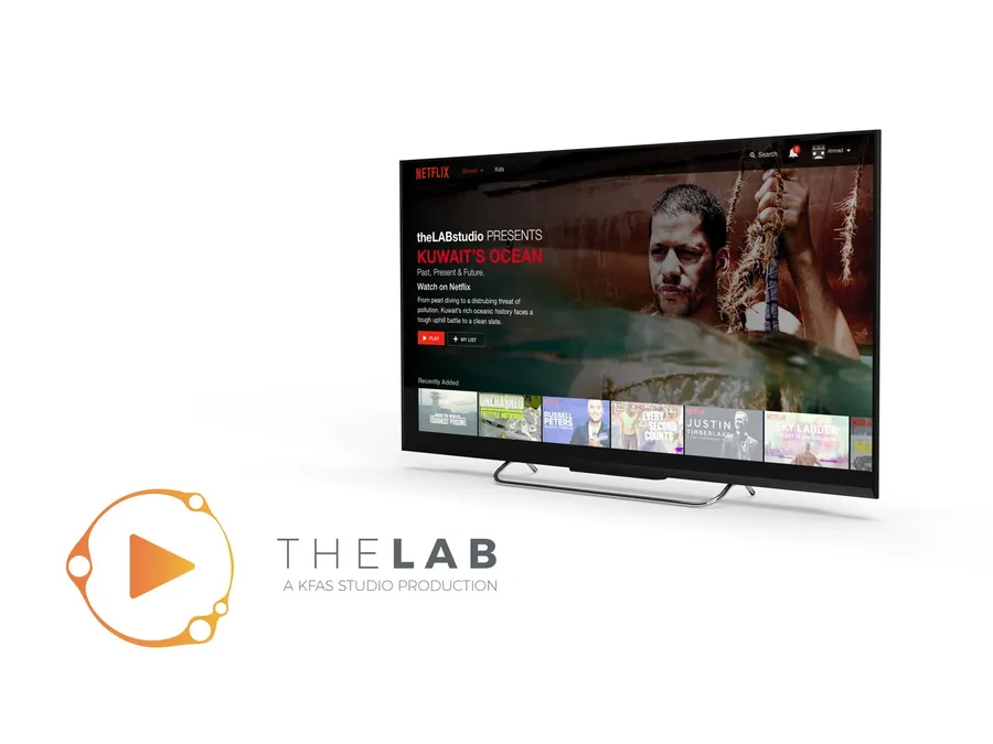
> Today, video has even reached the educational market with phenomenons such as linkedin learning and kahn academy. These multimillion dollar companies have shown us that users would rather ingest and learn through video rather than traditional methods. #### A Brief Introduction: The “iGen” Demographic It is no surprise that the “Centennials” or how we’d rather call them, the “iGen”, have grown up with these smart devices since a very young age and some have been born after. This generation is of the birth year 1996 and up. The language they speak is that of connectivity, devices, social media, and the latest trends. To target this generation, and to improve their learning experience, build loyalty and optimize their time, we need to start to speak their language in the way they ingest content. It is no longer enough to focus on textual based methods of knowledge dissemination. The experience needs to be extended everywhere, from the television screens to the palm of their hand. #### On Demand, Socially Fueled It would be ignorant to peg video only to the iGen demographic. Video, especially after on demand services such as youtube, netflix and other streaming websites has ensured maximum convenience for viewers. Today, video has even reached the educational market with phenomenons such as linkedin learning and kahn academy. These multimillion dollar companies have shown us that users would rather ingest and learn through video rather than traditional methods. Another phenomenon that has added to this is the simple integration of social media and how it integrates with video so well for its purpose (likes, commenting, customized playlists and sharing). #### Numbers to Take into Account It is not a surprise that video is king when it comes to content consumption. It is faster to consume, more engaging, and provides the ability to become more visual. A few numbers to consider: \- Viewers retain 95% of a message when they watch it in a video, compared to 10% (text based). \- Social video generates 1200% more shares than text and images combined. \- Nearly 50% of all video is watched on a mobile device. \- By 2019, internet video traffic will account for 80% of all consumer Internet traffic \- More than 500 million hours of video is watched on youtube each day  #### The Lab/The Studio The concept of this studio is to create a multi-function video studio that caters to different types of video content. Within this studio we’ll be able to create videos for social media outlets in both long and short form video, interview style and talk show based informative programs, use the facility to record and conduct educational content such as experiments, and also be able to use the post production team to create content for digital publishing mediums such as the website, OTT platforms (such as netflix or web based streaming service) or even supplementary tutorial style courses for Udemy or even universities in the region. Of course, the equipment will also allow for on the go recording such as documentary or field recording, or even live event streaming. We have conceptualized the name and logo below to depict this studio as we believe the lab is the perfect name for this brand. A place to experiment and provide ground breaking results based on experimentation and innovation.  #### The Risk: Swimming Against The Tide Today it is difficult to fight for attention in a world where there are too many distractions that can stray us away from the right content. A world full of options when it comes to content consumption, especially amongst our youth. Entertainment and social media have taken over our time and motivation. This is no surprise as it is the form of digital media that both people and brands have invested in the most when it comes to content consumption. However, the knowledge based strategy organizations have seemed to fall behind and follow an older model of content creation. To reach our youth and ever technologically based population we need to enhance their development and quality of content they consume in order to ignite scientific thinking, environmental awareness, and better their knowledge acquisition in order to develop and drive our development (both economically and personal) and quality of life. Of course with newer technologies, comes newer problems. However, organizations have come to fight this battle for attention to bring in their demographics to learn and acquire knowledge better through content creation. The risks of not pursuing better quality of content to consume and not partaking in a project of this stature are outlined as follows: 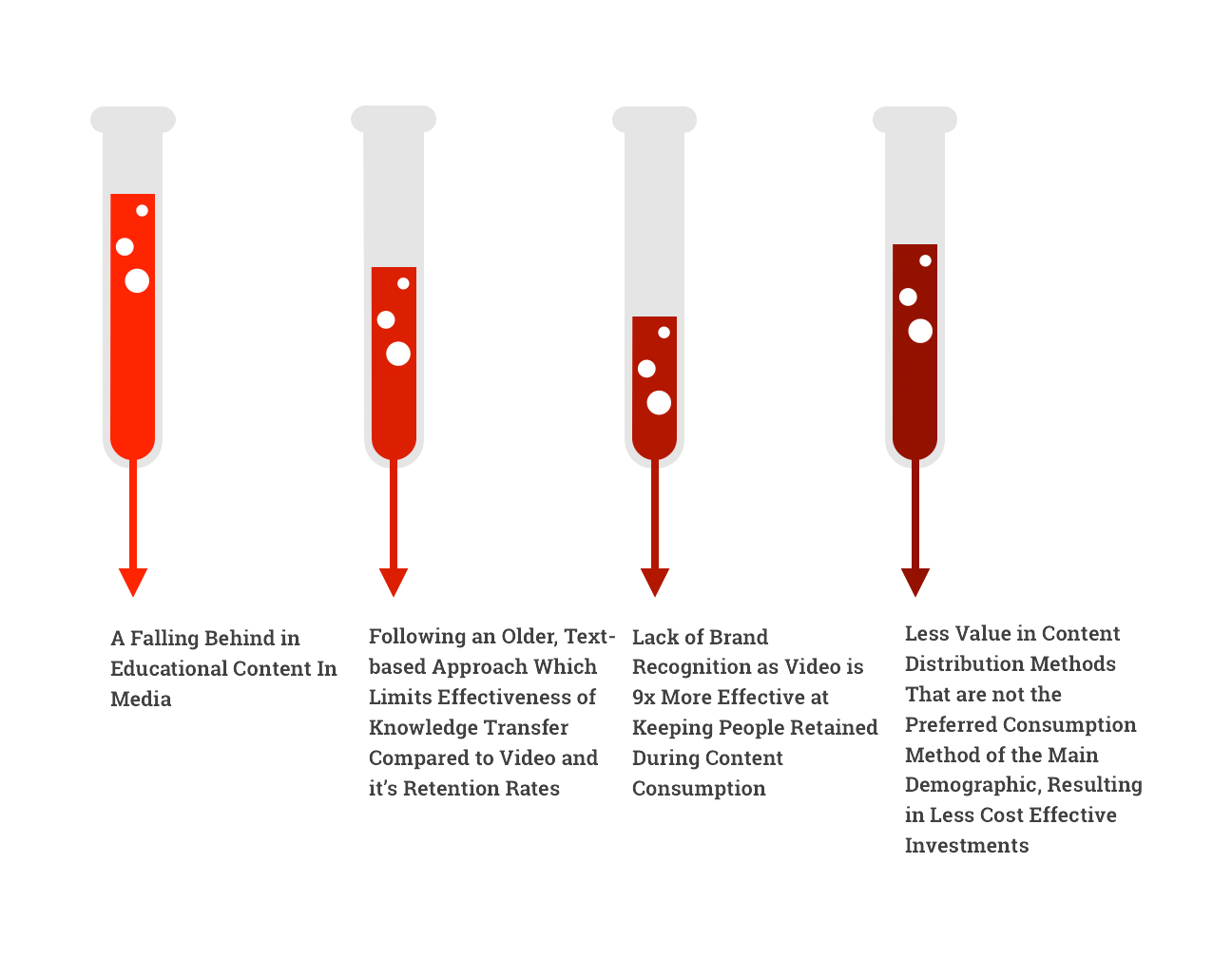 #### The Benefits: **1) Enhance Knowledge Transfer** With video, it has been reported that information is retained more effectively than traditional knowledge transfer when considering content creation such as the text based approach. Leading to a better knowledge based society. **2) Socially Fueled & Viral** With video based content, we have seen a rise in the willingness to share amongst peers, meaning more content that is created via video is more likely to be shared and go viral. Resulting in a wider acceptance and reach for knowledge transfer. **3) Lesser Bounce Rates & More Engaging** Quality video content tends to keep the user not only consuming content for longer periods of times, but also keeps users consuming different types of content for longer. The time to consume a video is much less than reading an article. So if a user is not happy with the content their viewing, instead of leaving, there is more time for them to discover other videos to stay engaged in the content distribution chain. **4) Promoting Innovation** By producing quality content that users desire and consume conveniently, we are powering them to become more innovative with their train of thought and research. By creating these videos, we also invite leaders in the field to contribute their innovative research and studies to be presented through this video platform. **5) Building a Brand Viewers Trust** Through video, we will be building a brand that is not only promoting science but adapting and promoting the technologies and content consumption methods that viewers consume daily. **6) Promoting & Creating a Community** Through partnerships and co-created projects, KFAS can create a community that fosters scientific and technological innovation. These projects will promote collaboration and help excel the scientific community into the forefront. #### Why Video? \- 75% of senior executives watch work-related videos on business-related websites every week and that 59% of senior executives prefer to watch the video if both text and video are available on the same topic on the same page. \- According to a survey compiled and released by Hubspot; 85% of people say they’d like to see more video from brands in 2018. This displays the customer demand for an increase in video based content. \- Studies by consultancy Insivia.com show that adding video can improve your ability to remember concepts and details — with effects that can increase over time. Viewers retain 95% of a message when they watch it in a video compared to 10% when reading it in text. \- A study conducted by Cisco, has shown that there is a growth in the need for internet based video traffic. Their forecast shows that by 2019, internet video traffic will account for approximately 80% of all consumer internet traffic. This shows the growing importance of getting your message across through video based content. \- Google has released a study stating that searches related to “how to” on YouTube have grown 70% year on year. This shows the demand of educational and instructional content through video based content. 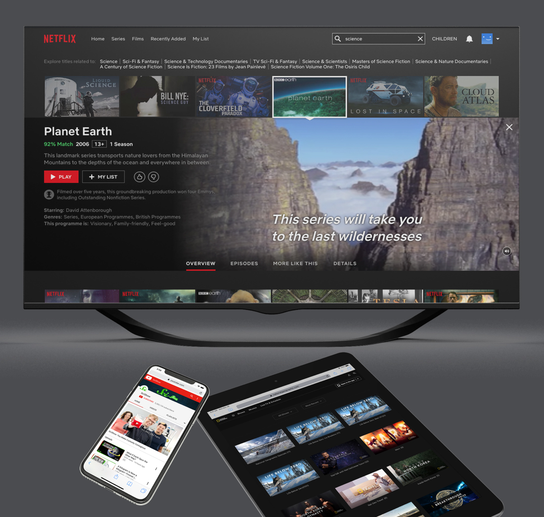 #### The Proposed Formats: VOD (Video on Demand) The key aspect of this project is to build a studio in which KFAS can create valuable video content that can be streamed on demand by the customer at their own convenience. The on demand video model focuses on several key time frames. **1\. Short-term Turnover Video** **2\. Medium-term Turnover Video** **3\. Long-term Turnover Video** These types of videos are to target to different platforms and viewer requirements. Each time frame will focus on providing content within specific frameworks and strategies in order to fulfill the viewership’s needs. Each time frame will be explained in more depth on the forthcoming pages. #### Live Video Live video caters to a content consumption funnel that may be rare compared to the video on demand, but provides its own usefulness and strategy. The main aspect of this video funnel is to cater to the users who wish to view events or scenarios that will occur during live functions such as conferences or special events. 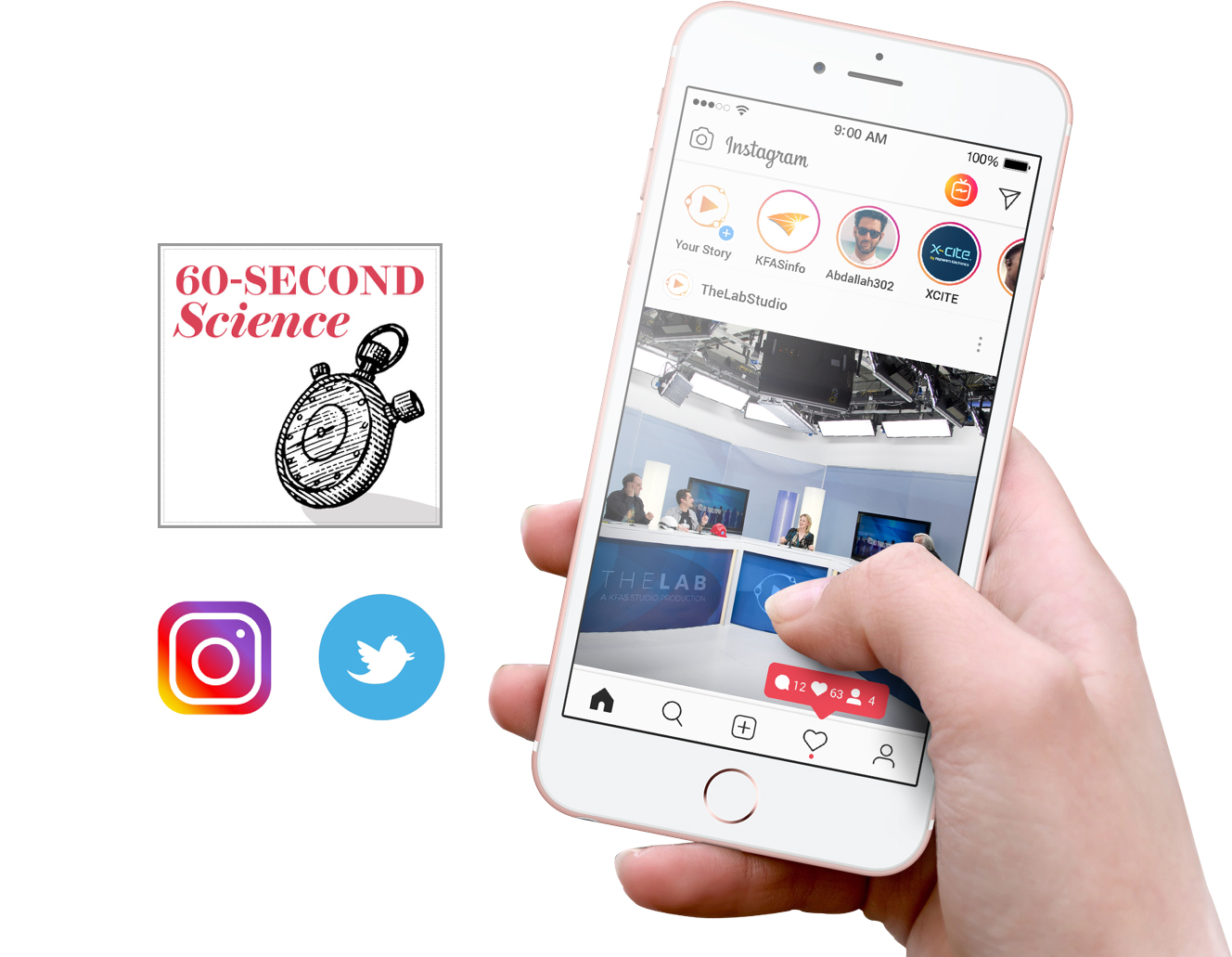 #### The Short-Term Turnover Video **Quick, Bitesized & Plentiful** The idea of the short term turnover video is to create quick and bitesized video clips for social media such as instagram and other short form video content such as twitter. The concept of this is to recycle clips from other medium and long form content, and create new fresh bite sized video clips for daily consumption. The idea behind these videos is to have constant video based content that will keep your users engaged and coming back daily to keep updated with science videos. This type of content is created through a calendar which focuses on creating many different short form videos throughout a day to be released throughout the week. By creating 5-6 short form clips a day, these can be distributed throughout the week by posting 2-3 per day. The benefit of this is to begin creating a library of short clips to be used on social media where your users will be to absorb this type of content. We must not ignore the short form videos as the majority of our userbase will be looking for content less than two minutes to view whilst on the go throughout the day. Our main target here will be mobile and social users. Examples of this type of video can be seen through Scientific American’s 60 second science. Useful clips that are created such as spots from interviews with KFAS guests, experiments from the medium form content or even highlights and/or trailers from the long form content. 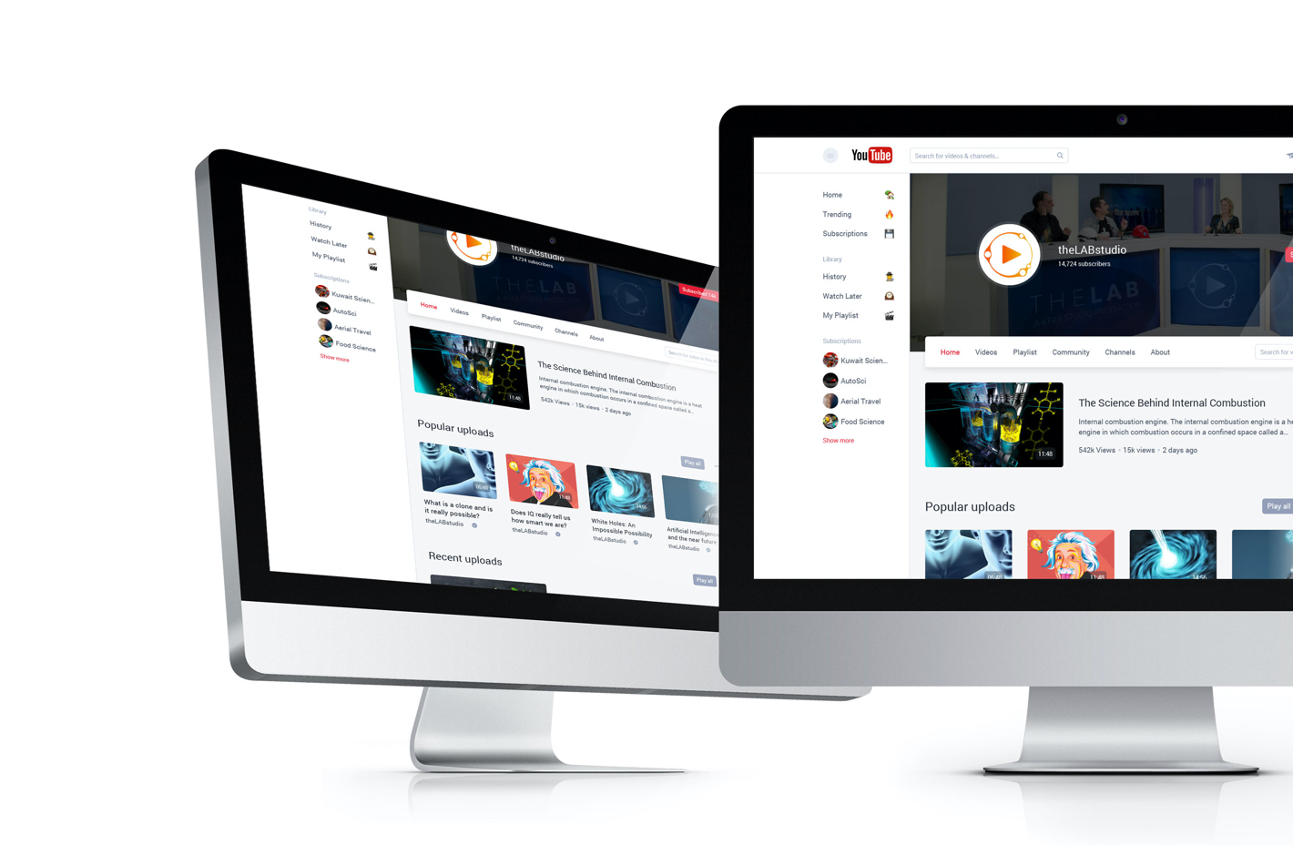 #### The Medium-Term Turnover Video **Programatic, Strategic & Social** The purpose of the medium-term turnover video is to provide engaging and educational content that is to be consumed mainly behind a desk (not limiting to as mobile will also be a substantial target). The purpose of this media is to keep users engaged through more details programmatic video content. An example of this can be seen in programs such as the Science Show on youtube; that produce an average of 6-7 minute videos on scientific topics that go more in depth than the short-form video. These videos will strategically outline concepts and have a schedule based on themes and ideas. The medium term videos can also be applied to special guests that KFAS bring in for conference. The best medium to host these videos would be on the website, youtube and even on smart tv and smart phone applications through a CMS specialized system for video such as the NatGeo smart TV app. The content schedule for this would be to ideally put out 2-3 medium term videos a week. However, from a content creation standpoint, we would ideally be planning for 5-6 videos a week. Giving room to create a backlog of videos to be used as an archive, and to always have unreleased videos ready to be published in line with a content schedule. This allows for programatic posting, and clock-work like distribution of video. 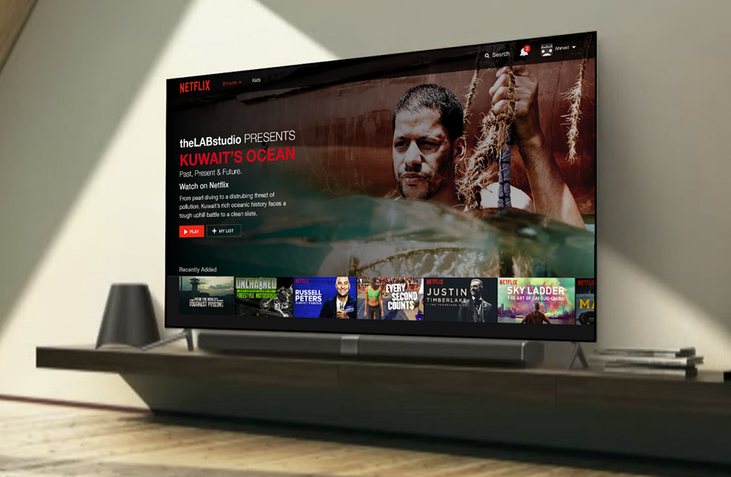 #### The Long-Term Turnover Video **Depth, Detail & Cyclical** The long term video is based on a cyclical schedule. This is long form, high quality, carefully created content. This schedule will see one documentary style video to be completed per year. This is to be distributed on OTT/VOD platforms such as Netflix. The purpose of creating this long form type of content is to disseminate quality programs throughout the Middle East, expanding the knowledge transfer of scientific and technological topics. In the example seen on the left, the concept of a documentary about Kuwait’s Oceans would focus on the importance of the Kuwaiti heritage and history of the pearl divers, and how this important history is being damaged by pollution. Bringing in experts to discuss scientific methods of solving this problem can not only create awareness across the region, but also allow for the scientific community to theorize a science and technological based solution for this. The more in depth and detailed these types of documentaries are, the more effectively KFAS can reach its mission statement and organizational values. The great thing about this long form content, is that once completed it can be broken down and recycled into the short and medium form type of content. Creating trailers, advertisements, (medium form) or even just snippets for social media and teaser campaigns (short form). This ensures and adds to the content creation funnel.  #### The Growing Need for Live Video **Up to Date & Engaging** The potential to reach thousands (or more) of new customers with the click of a button is becoming a reality. Organization’s in today’s work are convinced on the benefits of live video from a marketing perspective. But, what about from an educational perspective? Although, most live videos are actually watched through a stream after the live video has happened, the actual rates of live viewership is growing. This presents a fantastic opportunity for quality content to be created and engaged with live. With the growth of Instagram live, youtube live, and many other video streaming services, brands and organizations are racing to acquire their share of the market of this growing desire from the market. The great thing about live TV, is that it is RAW. It creates a closer connection with your viewership as they feel a part of the process and it begins to build and fortify your customer loyalty. It is said that the live streaming industry in 2016, was valued at more than $30 billion. These numbers were at an early phase where live video began to rise as an online trend. It is projected that in 2021, these numbers will more than double to become closer to a $70 billion dollar industry. These numbers show the growing importance for brands, especially those in niche markets such as Science. Live streaming can be used to capture behind the scenes from lectures and events that KFAS conduct, it can be used to show the team working on upcoming video content, it can be used to educate and disseminate knowledge such as educational content and webinars. These can be conducted in both the raw methods (instagram live and similar social live video videos) or even as a post production quality video such as youtube live streams (using the studio, we can add overlays, animated graphics and transitions during a live broadcast). 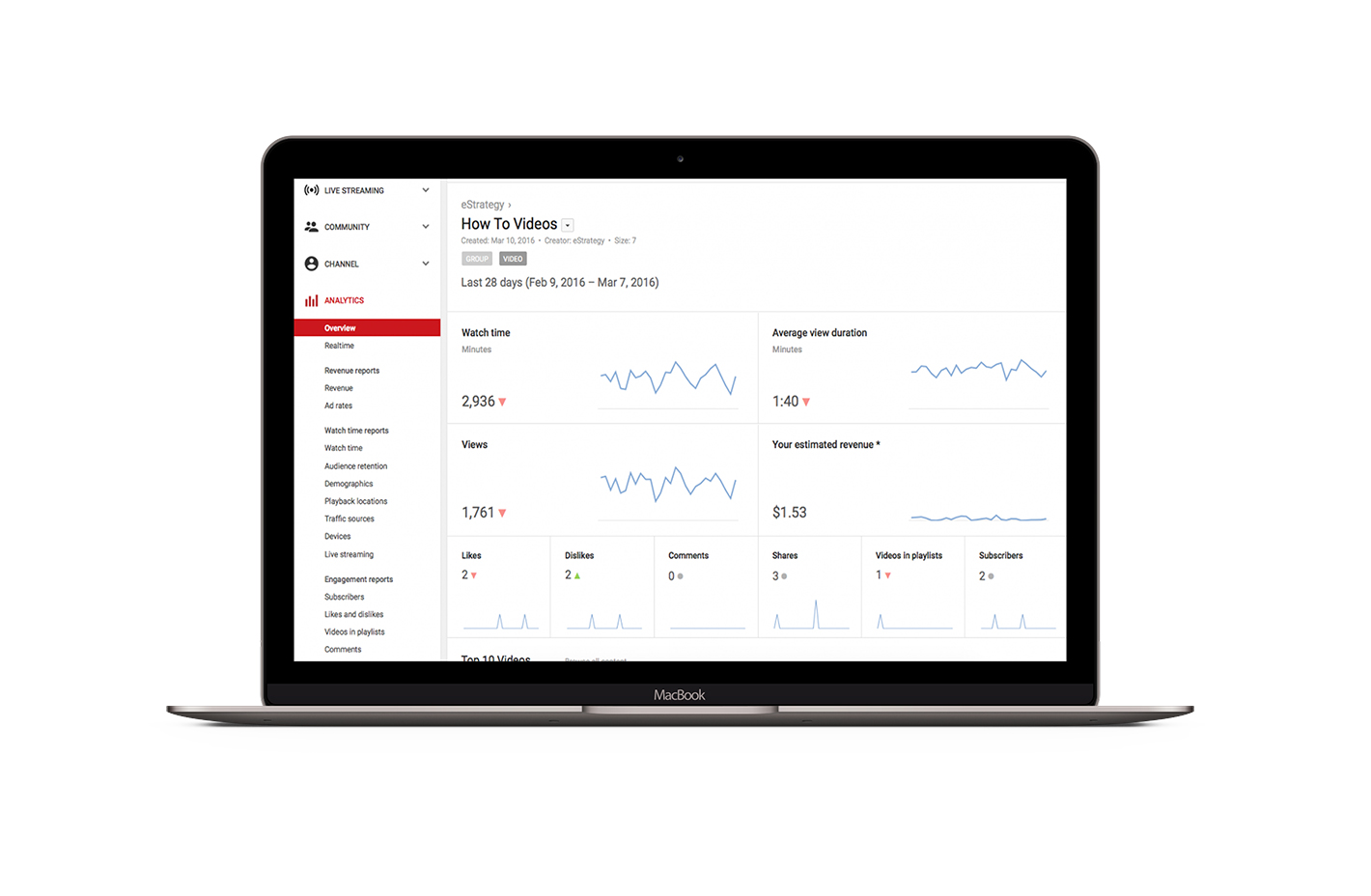 #### Analytics & Usage Data **Comprehensive & Real-Time** Video is the most engaging form of content on the planet. While it is powerful as a type of media, it also provides deep insights into the behavior of your audience. It is important to access detailed data on who is viewing your content, how it is being viewed (devices, browsers, operating systems), how long it is being viewed, and where viewers are coming from. With these types of platforms you can analyze player loads, views, viewed minutes, percent of content viewed, new viewers, unique viewers, attention span, top domains, geography, traffic sources, search terms, and more. With the right analytical data, organizations can make the right decisions on which videos are working for them and which are not, which comes in to heavy importance on regular scheduled video forms such as the short and medium term video. This data is also a feed that can provide insights on ROI of video and allow decision makers to make the right decisions when it comes to their video strategy. 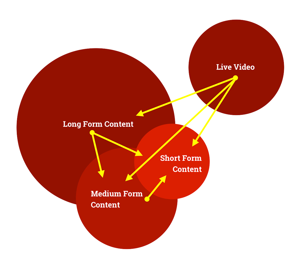 #### Overview of the Content **Dedicated & Recyclable** The content market is in a debate about quality vs quantity. When the reality of it, is that both are equally as important. However, by focusing on quality content, especially when it comes to video, you are in turn creating quantity. Each content length form has it’s own specific parameters in which a specific strategy is applied. In each scenario, quality is the main goal, not quantity. But, within itself, by creating quality content, you are in turn able to create a large number of quality content. This is because each form of video is able to be shared and recycled into each other. The long form content can be snipped into short form snippets or teaser campaigns to be shared and added into the short form content schedule. The long form content can also be cut down into clips and trailers that can be shared amongst the medium form content strategy. The medium form content, can also be shared into as clips and snippets into the short form content. The same applies to live video. Events and webinars can be clipped into being shared as medium and/or short form content, but also can be repurposed and sent to post production for long or medium form content. This is the beauty of creating a realistic content schedule and focusing on quality. From there, each form of video content is able to supplement and aid in the quantity of the other with minimal work and effort from the post production team. The chart on the right hand side helps to illustrate this content framework. #### Birds Eye View of The Studio: Outlined 1\. Multi-Purpose Studios & Production Team 2\. Post Production & Post Production Team 3\. Live Vide & Live Video Team  The content market is in a debate about quality vs quantity. When the reality of it, is that both are equally as important. However, by focusing on quality content, especially when it comes to video, you are in turn creating quantity. Each content length form has it’s own specific parameters in which a specific strategy is applied. In All three of these sections will outline the basic functions of the studio. Section A will be focused mainly on the studio itself. Where the majority of the video recording occurs. This studio should be dynamic in order to match sets and scenarios for different recording purposes. One of our solutions includes using a green screen drop down in order to make use of background changes in order to dynamically change the settings. Mobile sets such as desks and setups should be in place in order for the set to dynamically change. Each recording set up should be marked and prepared with presets to quickly adjust to each desired recording set up. Section B mainly consists of computer hardware, software and the team that will turn the video recorded from both the studio and live video into post production quality. This is where the editing, motion graphics and manipulation of videos happen. Section C consists of a team that is mobile and has hardware that can be used on the go for out of studio recording. This team will be focused mainly on live video, but can be used to also record and produce video for events or any other situation that requires a mobile team. Each section will integrate with each other heavily. Section B will be the intermediary that functions most with the other two sections.
ZAIN eSports
In 2017, I spearheaded an innovative initiative at our company, which came to be known as the Innovation Program. This program was designed to empower our employees to pursue novel projects or explore potential business avenues while taking complete ownership of their endeavors. The fundamental objective of this program was to provide a platform for employees to conceptualize, strategize, and execute their projects with the support of our organization. Upon identifying a promising project in 2018, I conceived the idea of creating a regional esports powerhouse that would foster and organize gaming tournaments and leagues for enthusiasts across the region. Our vision was to establish an infrastructure that would enable amateur and grassroots players to develop and flourish into professional esports players. Recognizing the potential of this project, we actively sought a prominent telco to partner with us, and after extensive negotiations, we found the ideal collaborator in Zain. (We invite you to download the public pitch deck we used during the business development process with various telcos in the region by [downloading the following PDF](https://cdn.prod.website-files.com/66c8ba6cd0ad61e4b10e4cbe/66d07dcf89a6539504fb2541__eSports_ProjectBrief_ReducedFileSizeVersion.pdf).)
Wilson & Bass
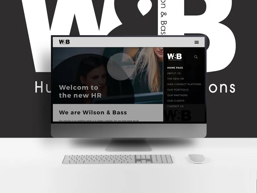
The task at hand was to fully brand a new Human Capital Solutions company. The desired brand was to be very neutral, with blacks, whites and greys. The client needed the brand to speak to large enterprises as they were their target market. Yet, they wanted a modern edge to their brand that spoke to C-Levels as well as entry level employees. The task at hand was difficult, but the client was very satisfied.
The Story Point Calculator
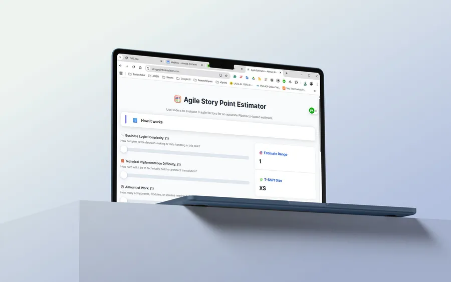
I took it upon myself to vibe-code my way to a tool that I could use on a daily basis. The Story Points Calculator is a Progressive Web App (PWA) designed to assist Agile development teams in estimating story points during planning poker sessions. This tool provides a structured approach to breaking down and evaluating user stories based on multiple complexity factors. I also use this tool as a product manager to pre-plan my roadmap for the coming cycles. I apply the same general questions to product features when asking developers from a high level about the features I want to build and it significantly helps me plan the cycle ahead. [Visit Now](https://www.storypointcalculator.com)
Talabat UI/UX Concept
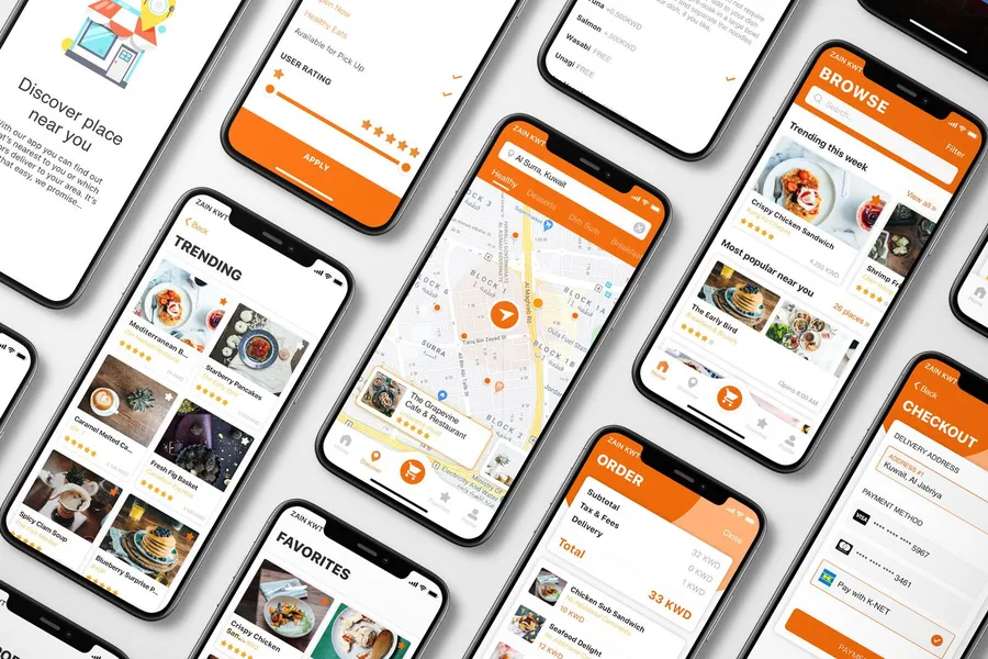
Talabat is a behemoth in the region. It was acquired Delivery Hero in 2015 and has expanded ever since. The idea that Talabat has not had a major brand refresh or UX/UI overhaul has been alarming as their previous iterations of their UI & UX have not been the most pleasing of experiences. This project proposes a tweak on the brand by creating an icon to be placed next to the text based logo and overhaul it's UX & UI to a more friendly and easier to use experience
Sultan Telecom Corporate Profile

This project was to create a modern looking corporate profile that spoke to the cutting edge technology solutions & services that the company provides, but to also keep true to its heritage and what their loyal customer base have come to expect. It's not always easy bringing a more modern style into a company's branding collateral but I do rest easy in believing that this end result has not only satisfied the client but their loyal customer base who have already come to know the brand for what it is.
NBK Automated Audit
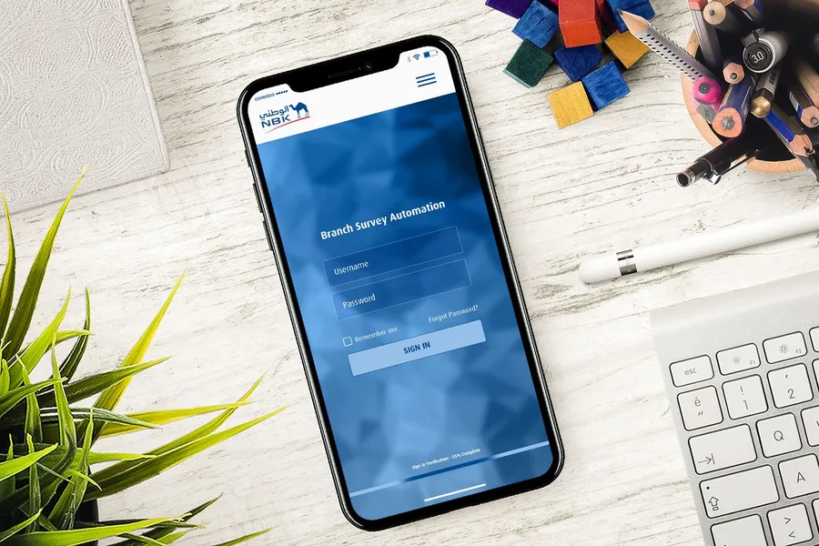
This was a project in which we were brought on as consultants to help improve time of completion of the branding department’s branch audits. We took a mainly paper-based process, and created a digital platform in which all stakeholders can benefit from reduced time to completion and improved usability. The application consists of two main sections. The dashboard where audits are created, distributed, approved and analyzed (through a fully automated, custom analytical dashboard) and an audit section in which staff can partake in creating branch audits via their mobiles or tablets through our platform. Please do note, that all images in this project are not the final designs, these were the proposal mockups. I opted not to do this in protection to privacy of information not to be displayed online. A lot of sensitive data has also been redacted in respect to the client.
Kuwait SC Rebrand
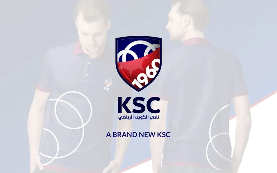
The purpose of this project was to present the club with a modern logo redesign without sacrificing the history and culture of the club. The logo was more of a refresh, the approach was to present to the club a brand new fresh approach to merchandising and jersey design using this newly refreshed logo.
Items Details Page Design (Bleems)
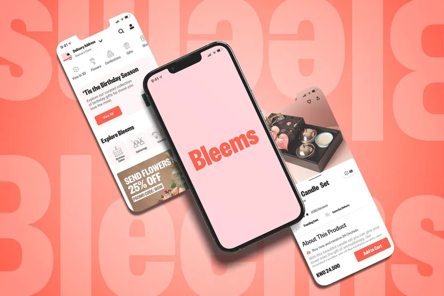
During my tenure at Bleems, I identified a critical opportunity to improve the performance of our item details page. The existing design, while functional, left room for improvement in terms of driving conversions. By focusing on optimizing the information architecture and refining the layout, I sought out with the team to create a page that struck the perfect balance between relevance, usability, and visual appeal.
Checkout & Purchase Flow Optimization
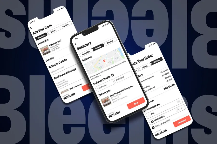
Our goal with this project was to redesign the checkout experience to improve usability, eliminate friction, and achieve better business outcomes. For consumers, the focus was on creating a checkout process that was seamless, intuitive, and personalized by breaking it into logical steps that matched their behavior. Our historical analytics revealed a significant drop-off in the add-to-cart conversion rate during checkout. To understand why, we conducted customer interviews and discovered that new customers (especially first timers coming from marketing campaigns) found the our one-page checkout overly long and confusing. They struggled with the lack of clarity about their progress through the process and felt overwhelmed by the mix of what seemed to them like unrelated actions—personalizing orders, entering delivery details, and making payments—all crammed into one page. For the business, the primary objective was to simplify the journey from product selection to payment (reducing as much friction as possible), boosting conversion rates while also introducing innovative, user-centric features like the "I don’t know the address" option. This not only solved a common gifting pain point but also helped differentiate our experience from competitors. Initially, we aimed for a 7% improvement in conversion rates, but we ultimately achieved an impressive 16% increase. 
AOU Digital Bookstore

Knowledge is the absorption of data and processing it from raw data to insights. Understanding these insights is what helps generations move forward and innovate. This was the main motivating factor of this project, was to provide an educational institute with a medium in which it's students can be empowered by gaining knowledge. The AOU interactive digital bookstore was born.