
Bleems S.P.C.
completedProject Brief
The item details page is where browsing turns into buying, and at Bleems it was underperforming. The existing design worked, but it did not put first what a shopper needs in order to commit. Key purchase information competed with secondary content, and useful tools were hard to find.
I identified the page as a conversion opportunity and led the redesign with the team. The aim was a page that puts purchase-critical information first, keeps supporting detail within easy reach and builds trust quickly, without adding clutter.
Scope of Work
I structured the work around five areas, from information architecture through to measurement.
Information architecture
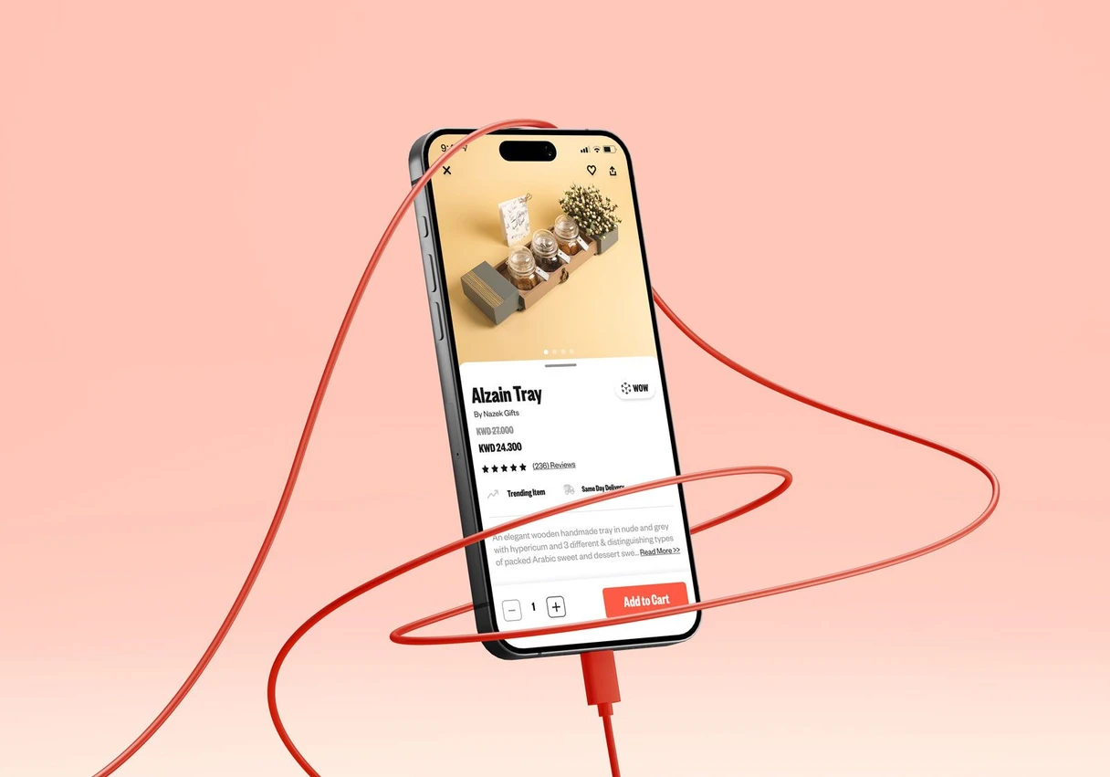
Purchase-critical details (product name, price, delivery options and Add to Cart) are immediately visible and scannable. Supporting information such as dimensions, descriptions and reviews is grouped into clearly defined sections, so the detail is there without crowding the decision.
Layout priorities
- A high-quality image carousel with intuitive navigation, pinch to zoom and a fullscreen view.
- Clear prominence for the product name, the price and trust signals such as "Trending Item" and "Same Day Delivery".
- Size Guide and AR View easy to reach, with short labels that explain what each tool does.
- Similar Products presented as a horizontal row of visually complementary items.
- A bold Add to Cart button paired with a simple quantity selector.
Experience details
Fast delivery options are highlighted with clear icons, and customers can check availability for their location. The star rating and review count link straight to the reviews section. Share, favorite and enlarge controls follow one consistent pattern, and interactive tools like AR stay available without pulling attention away from the purchase.
Success measures
We set targets up front: at least a 2.5% lift in conversion and at least a 5% reduction in bounce rate.
Delivery
Low and high-fidelity prototypes, detailed UI for the Size Guide and AR integrations, and documentation of behavior and user flows for engineering. We validated the design with usability testing and A/B tests.
Project Details
The redesign beat both targets. Conversion rose by around 3.4% against a 2.5% goal, and bounce rate fell by almost 6% against a 5% goal.
The gains came from hierarchy rather than decoration. With purchase-critical information in a predictable place and supporting detail grouped into distinct sections, customers could decide faster and with more confidence.
The project reinforced a principle I apply to every commerce surface: work out what the customer needs in order to commit, put it first, and make everything else earn its place.
The final designs are shown below.
Project Gallery